NICO!
SKATEBOARDING MAGAZINE
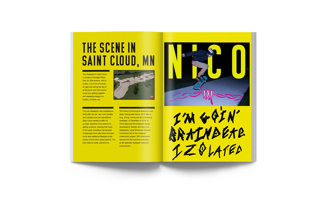
My next entry is a skateboarding magazine I created named after my friend, Nico. I was trying to emphasize originality using all my own photos and illustrations to create a skateboarding magazine that was based on the Saint Cloud skateboarding scene. I went out and photographed my friend skating and doing tricks across downtown Saint Cloud. I edited all the pictures with a 3-D glitch effect and added all my own graphics and type that I drew by hand to give it a grungy quality. I was inspired by famous skateboarding brands such as Vans and Thrasher. Hand drawn call out lettering throughout.
Illustration
Typography
Photography

PROCESS
In my creative process, I set out to create a consistent photographic effect on all my skateboarding photos in this publication. I tried a few different tricks, like putting type behind the figure. I finally centered on a 3-D glitch effect created by offsetting the red and blue layers within the photograph. This piece was made during the worst phase of the COVID-19 pandemic so in the call outs there are lines referencing the state the world is in and how isolated it makes me feel.